
가수면
Tailwind CSS 본문
https://tailwindcss.com/docs/installation
Installation - Tailwind CSS
The simplest and fastest way to get up and running with Tailwind CSS from scratch is with the Tailwind CLI tool.
tailwindcss.com
next에서 src 경로 사용할 경우
/** @type {import('tailwindcss').Config} */
module.exports = {
  content: [
    './app/**/*.{js,ts,jsx,tsx,mdx}', // Note the addition of the `app` directory.
    './pages/**/*.{js,ts,jsx,tsx,mdx}',
    './components/**/*.{js,ts,jsx,tsx,mdx}',

    // Or if using `src` directory:
    './src/**/*.{js,ts,jsx,tsx,mdx}',
  ],
그룹
부모 요소의 상태를 기반으로 요소의 스타일을 지정해야 할 경우, 클래스로 부모를 표시하고 grops 수정자를 사용하여 대상 요소의 스타일을 지정할 수 있음
<a href="#" class="group ~~~">
  <div class="~~~">
    <svg class="~~~ group-hover:stroke-white"...><!-- ... --></svg>
    <h3 class="~~~ group-hover:text-white">New project</h3>
  </div>
  <p class="~~~ group-hover:text-white">Create a new project from a variety of starting templates.</p>
</a>
주의점할 점
1. 동적 스타일 불가
어떤 방식이든 완전한 스타일로 입력해야 된다.
X
삼항 연산자
<div class="text-{{ error ? 'red' : 'green' }}-600"></div>객체 리터럴
function Button({ bgColor, ...props }) {
  const test: any = {
    black100: "#282828",
  };

  return (
    <button className={`bg-[${test[bgColor]}] {...props} />
논리곱
  const defaultColor: any = {
    black100: "#282828",
  };

  const darkClass = isDark && `bg-[${defaultColor[bgColor]}]`;

  return <button className={`${darkClass} ${className}`} {...props} />;
};
조건문
  const defaultColor: any = {
    black100: "#282828",
  };
  const darkModeColor: any = {
    black100: "#cccccc",
  };

  const darkClass = () => {
    if (isDark) {
      return `bg-[${defaultColor[bgColor]}]`;
    }
    return `bg-[${darkModeColor[bgColor]}]`;
  };
O
<div class="{{ error ? 'text-red-600' : 'text-green-600' }}"></div>function Button({ color, children }) {
const colorVariants = {
blue: 'bg-blue-600 hover:bg-blue-500 text-white',
red: 'bg-red-500 hover:bg-red-400 text-white',
yellow: 'bg-yellow-300 hover:bg-yellow-400 text-black',
}
return (
<button className={`${colorVariants[color]} ...`}>
{children}
</button>
)
}만약 동적 스타일을 사용하고 싶다면 주석으로라도 해당 색상이 프젝트에 최소 하나는 하드코딩 되어있어야 한다.
예)
  // const blueColor = "bg-[#7ECDF3]";
  const bgColorClass = `bg-[${COLOR_VARIANT[bgColor][darkMode]}]`;
  console.log(bgColorClass); // bg-[#7ECDF3]

  return (
    <button
      className={`py-1 px-5 ${TYPOGRAPH_VARIANT[size]} ${bgColorClass}`}
      {...props}
    />
  );
스타일 정리
display 관련
display: flex => flex
justify-content: center => justify-center
align-items: center => items-center
flex-direction: row => flex-row
flex-direction: column => flex-col
flex-grow: 1 => grow
text-align: center => text-center
gap: 10px => gap-2.5
grid-template-columns: repeat(4, minmax(0, 1fr)) => grid-cols-4
position 관련
position: absolute;
inset: 0px; => inset-0
크기
width: 100% => w-full
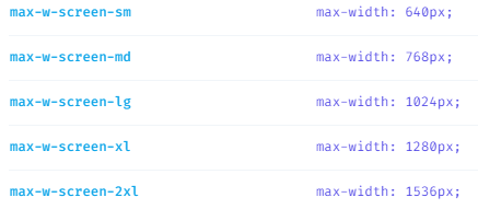
max-width
폰트
font-size => text-xs / sm / base / lg / xl / 2xl ~~
font-weight: 700 => font-bold
font-weight: 900 => font-black
여백
margin: 0 auto => mx-auto
margin: 10px => m-2.5
padding: auto 0 => py-auto
색상
background-color: teal => bg-teal-400
rgba => bg-teal-400/20
background-color: #3498db => bg-[#3498db]
color: white => text-white
opacity: 0.75 => bg-teal-500/75
테두리
border-radius: 9999px => rounded-full
border-width: 2px => border-2
border-style: solid => border-solid
반응형
<ul className="grid gap-4 grid-cols-1 sm:grid-cols-2 md:grid-cols-3 lg:grid-cols-4">
...처리
overflow: hidden;
text-overflow: ellipsis; => truncate
white-space: nowrap;
여러 줄 ...처리 => line-clamp-2 (...처리 후 계속 줄바뀜해서 나오는 눈속임이라 높이 제한해야 함)
다크모드
헤드 태그에 초기 렌더링 시 다크 모드 확인하는 스크립트 지정
next.js 기준으로는 최상위 레이아웃에 지정
// src\app\layout.tsx

export default function RootLayout({ children }: RootLayoutProps) {
  const setThemeMode = `
  if (localStorage.theme === 'dark' || (!('theme' in localStorage) && window.matchMedia('(prefers-color-scheme: dark)').matches)) {
    document.documentElement.classList.add('dark')
  } else {
    document.documentElement.classList.remove('dark')
  }
`;

  return (
    <html lang="en" className={`${sans.className}`}>
      <body className="flex flex-col w-full dark:bg-dark dark:text-slate-100">
        <script dangerouslySetInnerHTML={{ __html: setThemeMode }} />
        <Header />
        <main className="flex">
          <CategoryContextProvider>
            <Sidebar />
            <section className="w-full sm:ml-0">{children}</section>
          </CategoryContextProvider>
        </main>
        <Footer />
      </body>
    </html>
  );
}
이후 다크 모드로 전환하는 함수 설정
상태값을 만들어줄 필요도 없음
export default function DarkModeToggle() {
  const ChangeDarkModeHandler = () => {
    localStorage.theme = localStorage.theme === "dark" ? "light" : "dark";
    document.documentElement.classList.toggle("dark");
  };

  return (
    <div className="flex items-center gap-1">
      <LightIcon />
      <div className="relative w-10 h-6 bg-white rounded-full cursor-pointer" onClick={ChangeDarkModeHandler}>
        <button className="absolute top-0 left-0 dark:left-[calc(100%-24px)] transition-left duration-150 bg-river w-3/5 h-full rounded-full border-2 border-white dark:bg-lightDark" />
      </div>
      <DarkIcon />
    </div>
  );
}'React > 라이브러리' 카테고리의 다른 글
| nodemailer (0) | 2023.06.11 |
|---|---|
| react-markdown (0) | 2023.06.10 |
| [Framer Motion] Framer Motion (0) | 2023.03.28 |
| React beautiful dnd (0) | 2023.03.23 |
| [React Query] 비동기 취소하기 (0) | 2023.01.12 |
